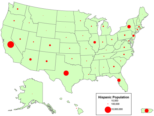
This is an example of a Range Graded Proportional Circle Map. It is a map of the United States. For each symbol shown on the map, its size is directly proportional to the size of the data it is representing. The Red circles are representing count data.
No comments:
Post a Comment