Monday, April 27, 2009

Univariate Choropleth Map


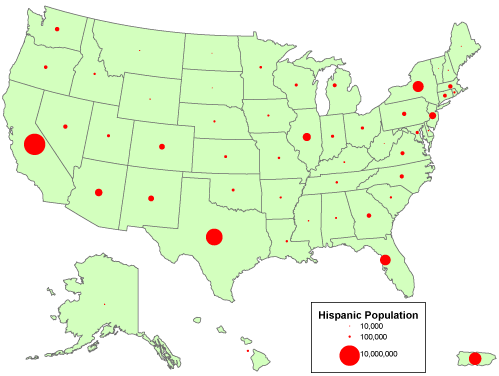
This is an example of a Univariate Choropleth Map. This example illustrates Raw Civil Liberties score. These types are maps are used when objects need to be classified one at a time. These objects may need to be classified individually because when they are put next to something else they have multiple attributes rendering them incomparable.

Cartographic Animation


This is an example of a Cartographic Animation. This example is of the Elements of an animated map. These maps are good for depicting movement over a given period of time. By the use of frames, a viewer is able to see animation of real time.

Nominal Area Choropleth Map


This is an example of a Nominal Area Choropleth Map. This example is of Access to safe drinking water. This type of map uses different colors to illustrate nominal areas. The problem with this map is that there is no hierarchy or order given.

Continuously Variable Proportion Circle Map


This is an example of Continuously Variable Proportion Circle Map. This example is of Count Data for the Hispanic Population is the U.S.. The different symbol sizes represent categories of data values rather than unique values.

Public Land Survey System (PLSS) Map

This is an Example of a Public Land Survey System Map. This example is of Alaska. These maps are good for describing and dividing up land in the U.S.. This map in particular shows all land owned by private, federal and state ownership.

Cadastral Map

This is an example of a Cadastral Map. The example shown is of Egypt near the Nile River. Cadastral Maps are created by combining different types of Cadastrals into one image. This map in particular incorporates topographic imagery so as to allow it the ability to compare with other Cadastrals.

Proportional Circle Map


This is an example of a Proportional Circle Map. The example shown is of River Characteristics. The Size of the circles shown is directly proportional to the size of the channels of the rivers. The colors of the circles are related to the colors of the water.

Propaganda Map


This is an example of a Propaganda Map. This example illustrates Germany as a weak military state surrounded by strong military states. Looking at the map, the message trying to be conveyed that Germany is militarily weak can be shown by all of the other artillery being aimed at Germany which is empty.

Statistical Map


This is an example of a statistical map. This example is of Napoleon’s Russian campaign of 1812. A statistical map is very useful in giving a standard statistic of the functional time course over a specified set of periods. According to this graph the lines shown represent the sizes of Napoleon’s army over a given period of time.

Flow Map


This is an example of a Flow Map. This example illustrates how to make a peanut butter jelly sandwich. Flow maps are very useful because they can take a process and visually break it down into a series of steps. This flow map is very thorough in breaking down each step to get to the end process.

Star Plot


This is an example of a Star Plot. This is a Star Plot of MER IDD and Automated Designs. A star plot is a tool used for examining the relative behavior of all variables in a multivariate data set. In this example the center red line represents the most desirable behavior.

Correlation Matrix


This is an example of a Correlation Matrix. This example is a calculated protein correlation matrix for phage T7. According to this graph more similar info is shown in red while dissimilar info is shown in blue. Many methods of multivariate statistical analysis rely on a correlation matrix as the initial data.

Similarity Matrix


This is an example of a Similarity Matrix. This example is of a Genetic Similarity Matrix among 33 cannabis accessions. This type of graph illustrates a matrix of scores which express the similarity between two data points. For these types of graphs higher scores are given to more similar characters while more dissimilar characters are given lower scores.

Stem and Leaf Plots


This is an example of a stem and leaf plot. This example is of new housing starts in the U.S.. This type of graph is useful in presenting quantitative date in a graphical format. A basic stem and leaf plot is composed of two columns separated by a vertical line. The column on the left is the stem and the column on the right is the leaf

Boxplot


This is an example of a Boxplot. This example illustrates the number of daily hospital births in Canada per day of the week. According to this graph the main values are held in the center of the boxes while the tails of the boxes represent the min and max values.

Histogram


This is an example of a Histogram. The example shown is of results from a test given to theoretical students. The categories are usually specified as non-overlapping intervals of some variable. In this example each interval is illustrated by a different bar color and represents a different score range.

Parallel Coordinate Graph


This is an example of a Parallel Coordinate Graph. In this example the parallel system is plotting baseball statistics. In a Parallel system the coordinate graph is used to plot large multivariate datasets.

Triangular Plot


This is an example of a Triangular Plot. This example illustrates the different kinds of waters typically found in geothermal areas. An advantage of using this graph is that three different categories can be graphed on separate vertices that make the graph easy to interpret.

Windrose


This is an example of a Windrose. This example is of Seattle Washington. Windrose Graphs are a great tool for illustrating wind speed and direction in a particular location. The location of each spoke is directly related to the amount of windspeed coming from a particular direction.

Climograph


This is an example of a Climograph. This example is of the Boreal Region in Montreal, Canada. This graph represents the average precipitation and temperature values for a given place. It can be shown by the graph that the precipitation is higher in Quebec do to higher temperatures.

Population Profile


This is an example of a Population Profile. This map illustrates the population of Coventry and compares it to the national population. The graph also compares the age and gender of Coventry to the national population. The graph is a simple two color graph which makes easy to view and interpret.

Scatterplot


This is an example of a Scatter Plot. This graph is useful in creating relationships between two variables. This graph illustrates the relationship between grip strength and arm-strength for 147 people who are involved in physically demanding jobs. This graph does not appear to have a strong linear relationship as shown by the many outliers.

Index Value Plot


This is an example of an Index Value Plot. This graph represents the Raw Arms Index For 2004. According to the creator of this graph it is not very useful because it is rather difficult to discern any information from it.

Lorenz Curve


This is an example of a Lorenz Curve. These graphs are used to Illustrate ownership and wealth. This graph in particular is illustrating Cumulative % of income against Cumulative % of population.

Bilateral Graph


This is an example of a Bilateral Graph. This map is an illustration of the very conservative with the conservative and the very liberal with the liberals. The two bars represent the Rates of Introversion (in Blue) vs. Extroversion (in Red) with Shyness and non-Shyness.

Standardized Choropleth Map


This is an example of a Standardized Choropleth Map. It is a map of Canada’s 2008 Census. It is illustrating the percentage of children age 14 years and younger. As can be seen by the legend at the bottom left hand corner the map shows roughly 4 classes with equal intervals.

Bivariate Choropleth Map


This is an example of a Bivariate Choropleth Map. It is a map of land use, life expectancy and GNP per capita in Africa in 1989. This is a very good map for demonstrating two variables. Map is able to show graphically and spatially the relationship between these two variables.

Unclassed Choropleth Map


This is an example of an Unlcassed Choropleth map. This map very hard to look at because of the many colors located in one specific area near the top of the map. This map would be far more presentable if the colors were limited to 6 or 7 so as not to confuse the viewer.

Classed Choropleth Map


This is an example of a classed choropleth map. This example uses five classes of equal value intervals to demonstrate the proportion of children ages 0-15. This is a good example because the number of classes is limited so as to illustrate valuable information without confusing the viewer.

Range Graded Proportional Circle Map


This is an example of a Range Graded Proportional Circle Map. It is a map of the United States. For each symbol shown on the map, its size is directly proportional to the size of the data it is representing. The Red circles are representing count data.

DOQQ


This is an example of Digital Orthoimagery Quarter Quadrangles. This example is of an aspect of Washington D.C.. DOQQ’S are digitized image of an aerial photograph. Orthophotos are a combination of the geometric qualities of a map mixed with the image characteristics of a photograph.

DEM


This is an example of a Digital Elevation Model. This example is of the world in varying colors to represent the stark contrasts in elevations. A Digital Elevation Model (DEM) is digital cartographic/geographic data in raster form.

DLG


This is an example of a Digital Line Graph. The example is of French Town, New Jersey. Incorporated into this map are three different representations; Boundaries, Hydrography and Hypsography. The larger blue line toward the bottom is the Delaware River. The area covered is 60 square miles.

DRG


This is an example of a Digital Raster Graphic. The example is of The DEVILS TOWER NATIONAL MONUMENT. A DRG may be used as a source or background layer in a geographic information system (GIS) to collect, review, and revise other digital data. A DRG can be combined with a DEM and a DOQ to produce an image with additional visual information for the extraction and revision of base cartographic information.

Isopleth Map


This is an example of an Isopleth map of deep south Texas and the lower Rio Grande Valley. This map illustrates the snowfall across these two areas. From the map it can be shown that the greatest amount of snow fell near the Gulf.

Isopach Map


This is an example of an Isopach map for the Rio Blanco tephra deposit. These maps are used to determine the volume of eruption. What can be seen by this map is that when the deposit erupted a strong wind passed by and caused most of the sediment to plant itself west south west of the vent.

Isohyet Map


This is an example of an Isohyet map of Burkino Faso. This map also includes other information such as crop use intensity and tsetse distribution. The Isohyet map illustrates the average amount of rainfall. It can be shown that the southern region was the area that received the most rain at the time this map was created.

Isotach Map


This is an example of an Isotach map. It illustrates the wind pattern for Hurricane Ava, June 6th 1973. There are two different lines present on this map. The solid lines are the streamlines which represent the direction of airflow. The dashed lines are the Isotachs and represent wind speed measured in meters per second.

Isobar


This is an example of an Isobar map. This map illustrates the a very strong wind current that occurred in May of 1999 over South Dakota and parts of northeast Wyoming. Each Isobar represents a 4mb pressure difference.

Lidar


This is a Lidar image of lower Manhattan taken in September 27,2001. This was a very helpful map because it produced a 3-D image of the area that was affected by the September 11 catastrophe. The 3-D image allowed clean up crews to know how high the rubble was so as to know what appropriate size crane to use to remove the rubble.

Doppler Radar


This is an awesome picture of a Doppler Radar which had an unsuspected use. Because Doppler Radar is sensitive to speed and must know weather speeds to determine the severity of a storm, it accidentally picked up a very fast moving vehicle moving down Interstate 57 in Chicago. The reason for this was caused by a warm layer of air rolling in above the surface which causes the beam from the Doppler to be reflected toward the ground.

Black and White Aerial Photo


This is a Panchromatic aerial photo of Papua New Guinea. This photo was taken with the aid of stereo which is a tool to make the picture look three-dimensional. In this photo North is up and the Buso river can be seen centrally.

Infrared Aerial Photo


This is an Infrared Aerial photo of the Lyndon B. Johnson National park. The park is located in Pedernales Valley and is surrounded by heavy vegetation such as Ashe Juniper and various species of Oak. The park sits on elevations ranging from 1000-2500 feet above sea level.

Cartogram


This is a Cartogram depicting data from the Global Amphibian Assessment which tracks the status of threatened amphibians. Eight species are examined. As shown by the legend at the bottom left, the percentage of endangered species is broken down into 5 categories from all around the world.

Isoline Map


This is an Isoline Map of an advancing time of tsunami registration on sea level stations in points. In this figure, the red color separates 30-minute hydro physical blind zones, and the green color separates areas of an arrangement of probable sources of a tsunami, the warning about which will receive in Jakjakarta timeliness.

Dot Distribution Map


This is a Dot Distribution Map of the 2000 census for the United States. The map was created in such a way that the population distribution would appear as lights visible during the night sky. On the page size version of this map each dot represents 7500 people.

Thematic Map

This is a Thematic Map of Canada. This map illustrates the prominent vegetation that covers the surface of Canada. The two most prominent ground covers are evergreen needle-leaf forest and low vegetation/barren.

Topographic Map


This is a Topographic map of India. India is a land of hills, rivers, plateaus, plains, beaches, deltas and deserts. India's highest elevations are located in the Himalaya Mountains in the northern region.

Thursday, April 9, 2009

This is a Topographic map of India. India is a land of hills, rivers, plateaus, plains, beaches, deltas and deserts. India's heighest eleveations are located in the himalaya mountains in the northern region.


A planimetric map of Iceland showing the provincial or state boundaries with provinces in high color contrast. Also shows provincial capitals, provincial names, major cities, major highways, secondary roads, major rail lines, major rivers and major lakes. Map offers a legend at the bottom right hand corner which indicates which area is the country capital, reginal city and other specific areas.